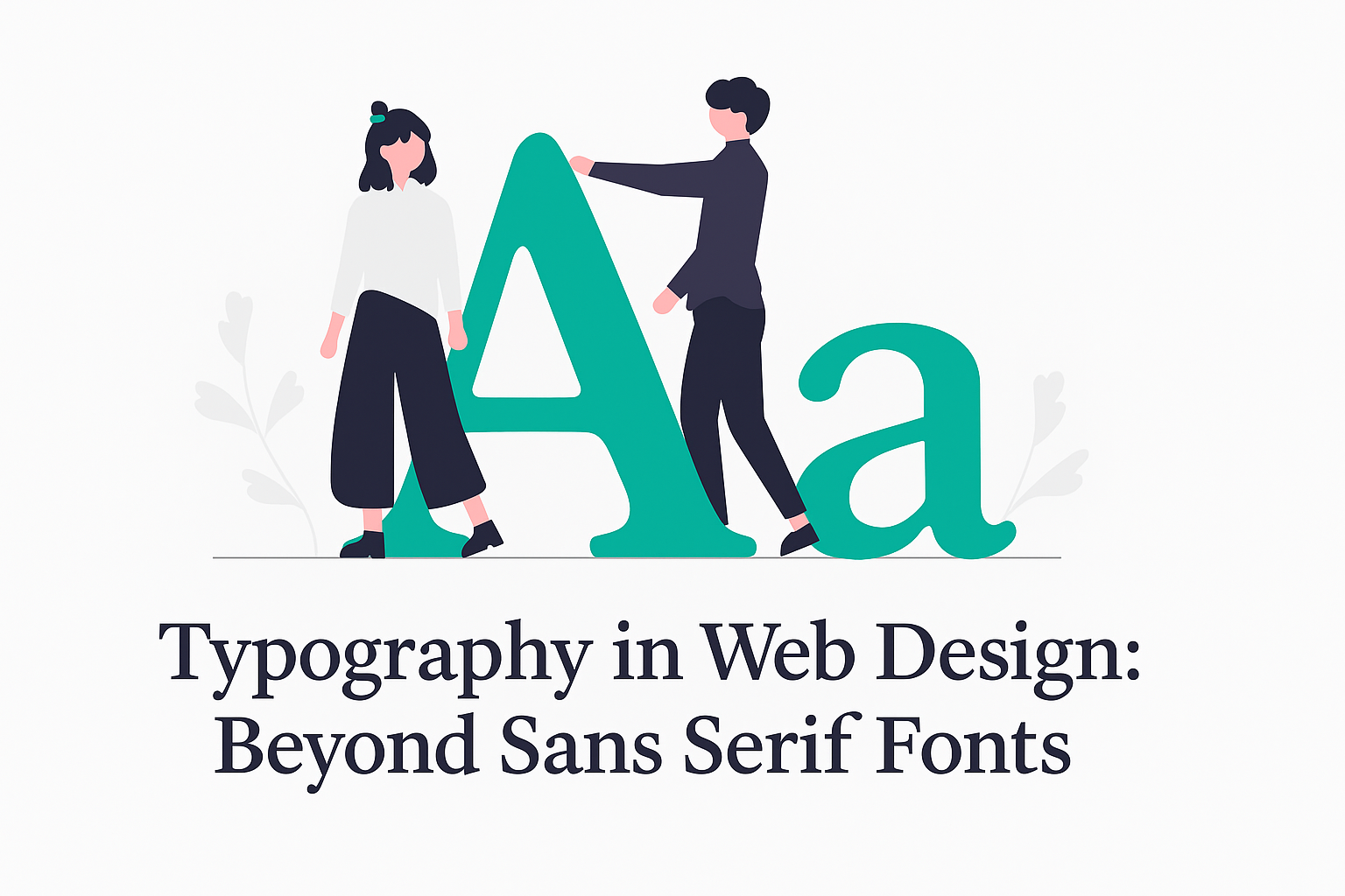
In the digital landscape, your website’s typography speaks volumes before visitors read a single word. While clean, modern sans serif fonts have dominated web design for years, there’s a vast typography universe waiting to enhance your WordPress site’s personality and effectiveness.
As an Amazon Associate I earn from qualifying purchases and sometimes recommend products from other sellers at no extra cost you. For more details see my disclosure policy and privacy policy.
Understanding Typography’s Impact
Typography isn’t just about making text readable—it’s a powerful design element that shapes your brand identity, guides user experience, and can dramatically improve engagement. The right typeface choices can convey professionalism, creativity, or warmth, subtly influencing how visitors perceive your business.
The Basics: Font Categories Beyond Sans Serif
If you’re new to typography, understanding different font categories will help you make more informed choices:
Serif Fonts: These classic typefaces have small decorative lines (serifs) at the ends of character strokes. Examples include Times New Roman, Georgia, and Baskerville. They convey tradition, reliability, and authority—perfect for law firms, educational institutions, or luxury brands.
Sans Serif Fonts: These clean, modern fonts without decorative lines include popular choices like Arial, Helvetica, and Roboto. They project clarity and minimalism, making them ideal for tech companies and contemporary brands.
Script Fonts: Mimicking handwriting or calligraphy, scripts like Brush Script or Great Vibes add elegance and personality. Use sparingly for headings or accents rather than body text.
Monospaced Fonts: Where each character occupies equal width (like Courier or Source Code Pro), these fonts improve readability for code snippets and technical content.
Display Fonts: Bold, distinctive typefaces designed for headlines and attention-grabbing elements, not extended reading.
2025 Typography Trends: Keep an eye on pixelated fonts, brutalist typography, and variable fonts that adapt to different screen sizes while maintaining visual interest.
Typography Best Practices for Web Design
Even with the perfect font selection, proper implementation makes all the difference:
Prioritize Legibility: No matter how beautiful a font is, if users struggle to read it, your message is lost. Ensure adequate font size (minimum 16px for body text) and sufficient contrast against backgrounds.
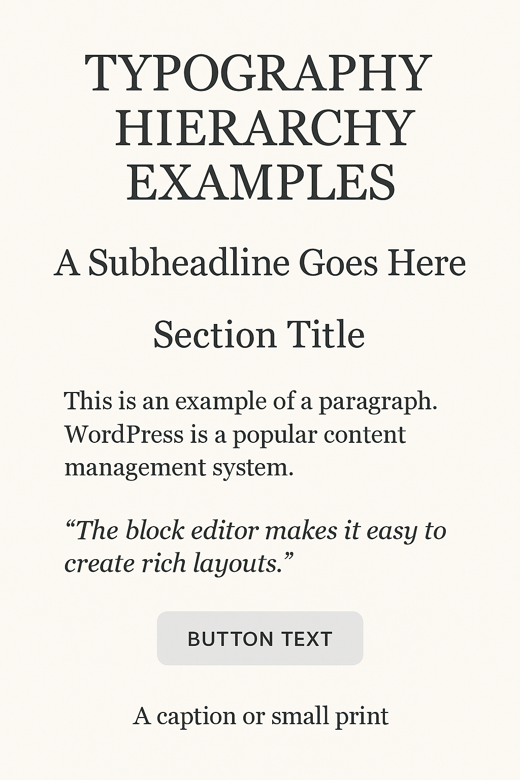
Create Clear Hierarchy: Guide visitors through your content by establishing visual hierarchy through font size, weight, and spacing. Headlines should immediately communicate what’s important, while subheadings break content into digestible sections.
Maintain Consistency: Limit your site to 2-3 complementary fonts to avoid a chaotic appearance. Consistent typography across pages helps reinforce brand identity and improves user experience.
Understand Typographic Terms:
Kerning: Adjusting space between specific letter pairs
Tracking: Uniform spacing between all characters in a text block
Leading: The vertical space between lines of text (line height in CSS)
Make Typography Responsive: Ensure your text remains readable across all devices with fluid typography that scales proportionally with screen size.
Implementing Typography in WordPress
WordPress offers several ways to control typography on your site:
Built-in Controls
Most modern WordPress themes provide typography settings through the Customizer or Site Editor. Here you can typically adjust:
In today’s fast-paced digital world, having a mobile-friendly website is no longer optional; it’s a necessity. Small business owners must understand the importance of mobile-responsive website design to stay competitive and relevant. This blog post will guide you through what mobile-responsive design is, its impact on user experience, and how you can implement it on…
Self hosted websites are becoming more and more popular these days. But what exactly is a self hosted website, and why should you use one for your blog? In this article, we will explain what a self hosted website is, and discuss the benefits of using one for your blog. We will also provide some…
Ever paused to consider how the simplicity of a sans serif font can make or break your brand’s digital handshake? Sans serif fonts, those clean and modern characters without the little feet, or ‘serifs,’ at the ends of their strokes, have become a cornerstone in design. They’re like the crisp, white shirt of the font…
There are lots of decisions to make when starting a blog but one of the key ones is choosing the best website hosting for your blog or business website. The whole concept of website hosting may seem simple – choose one and get on with it – but there’s a lot to consider in a…
During the lifetime of having a website, one of the big decisions to be made is who to host your website. Website hosting is like renting the land on which you then build your store – you don’t own it, but you can’t have the store without it! There are lots of different website hosting,…