In today’s digital landscape, your website is often the first touchpoint between your brand and potential customers. A cohesive visual system across your website isn’t just about aesthetics – it’s about building trust and recognition. When users encounter consistent design elements throughout their journey, they develop a stronger connection with your brand.
As an Amazon Associate I earn from qualifying purchases and sometimes recommend products from other sellers at no extra cost you. For more details see my disclosure policy and privacy policy.
Foundation: Establishing Your Core Visual Elements
Color System
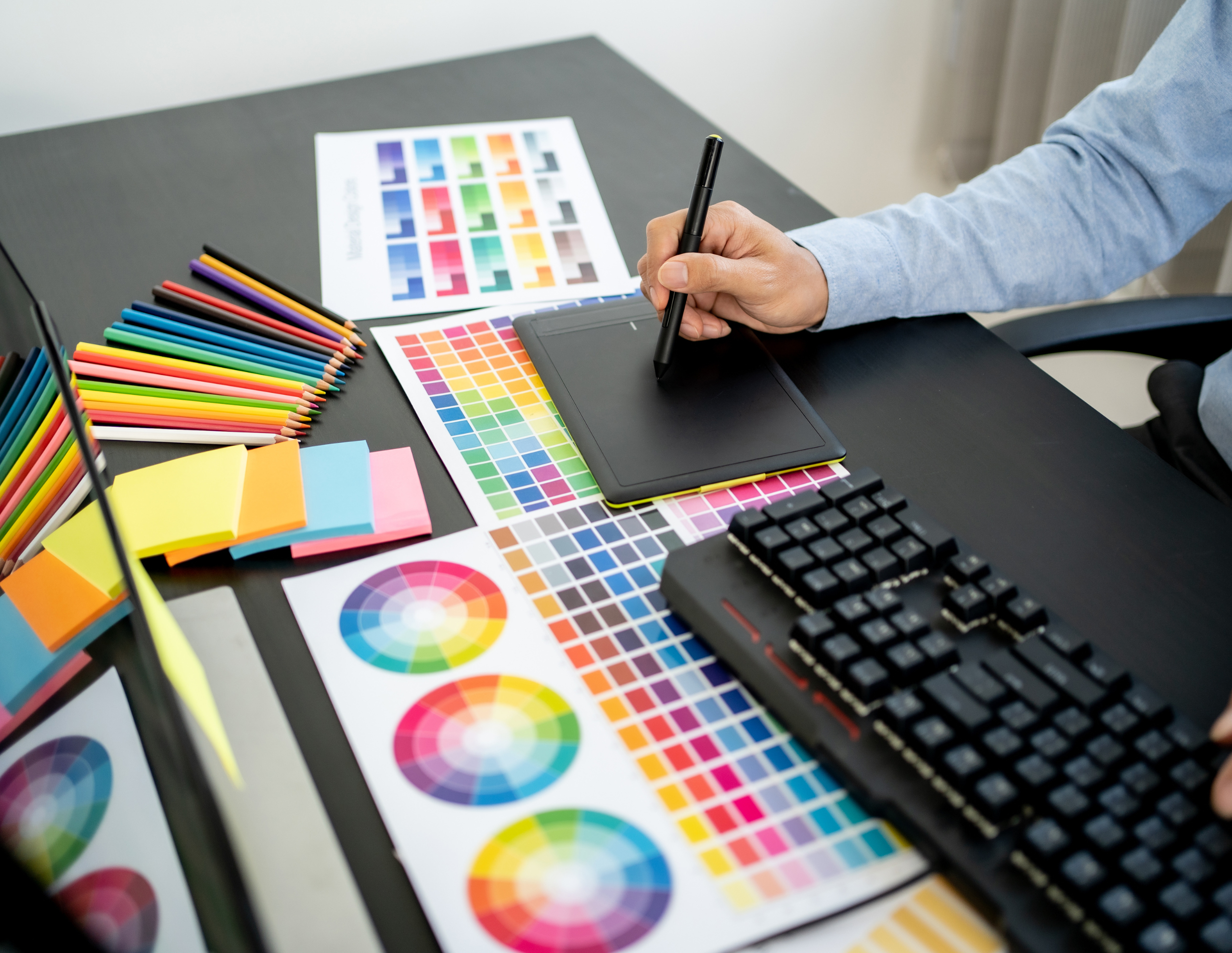
Your color palette is the backbone of your visual identity. Start by selecting 2-3 primary colors that reflect your brand’s personality and values. Add 2-4 complementary secondary colors to provide flexibility while maintaining consistency.
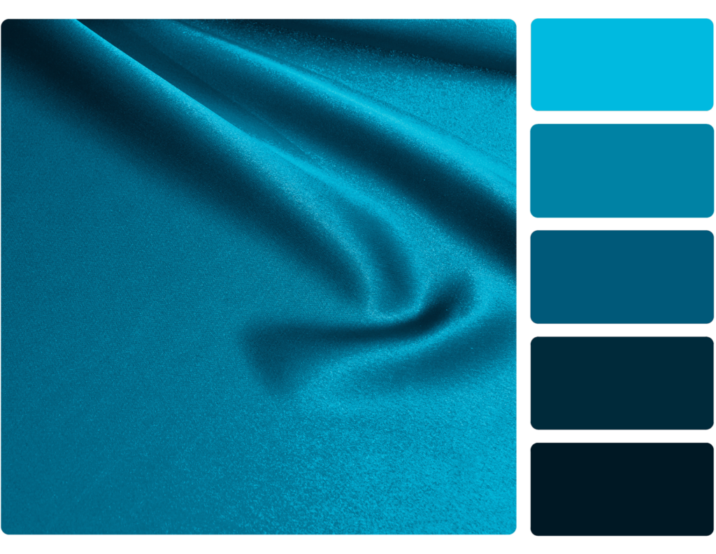
Remember that colors evoke specific emotions and associations. Blue often represents trust and stability, while orange conveys energy and creativity. Choose colors that align with your brand’s message and industry expectations.
Key considerations for your color system:
- Primary colors for brand recognition
- Secondary colors for flexibility and contrast
- Accent colors for calls-to-action
- Neutral colors for text and backgrounds
Typography Framework
Typography plays a crucial role in both readability and brand personality. Select no more than two main typefaces – one for headings and another for body text. A sans-serif font paired with a serif can create beautiful contrast while maintaining readability.
Your typography should scale well across different screen sizes. Establish a clear hierarchy with consistent sizing ratios between headings, subheadings, and body text. This creates visual order and helps users navigate your content effortlessly.

Design Elements
Your logo is the cornerstone of your visual identity. Create clear guidelines for its usage, including minimum sizes and clear space requirements. These rules ensure your logo remains impactful and recognizable across all applications.
Develop a consistent style for icons and decorative elements. Whether you choose outlined or filled icons, maintain the same visual weight and style throughout your website. This attention to detail strengthens your brand’s professional appearance.
Creating Visual Consistency
Image Style
Photos and illustrations should feel like they belong to the same family. Define specific criteria for imagery, such as lighting, composition, and subject matter. If you use stock photos, establish guidelines for selecting images that maintain your brand’s visual style.
Color overlays or consistent editing techniques can help unite diverse images. Apply the same treatment across all images to create a cohesive look. This might include specific filters, cropping ratios, or overlay colors from your brand palette.
Component Library
Buttons, forms, and other interactive elements should follow consistent patterns. Design these components once and reuse them throughout your site. This not only maintains visual consistency but also improves development efficiency.
Your component library should include:
- Button styles for different states (default, hover, active)
- Form field appearances
- Card layouts for content
- Navigation elements
Pattern Implementation
Headers and footers serve as visual anchors for your website. Keep their design consistent across all pages to provide a familiar framework for users. This consistency helps visitors navigate your site with confidence.
Layout patterns should follow a clear grid system. Establish standard spacing units and stick to them throughout your design. This creates visual rhythm and makes your content more digestible.
Maintaining Brand Cohesion
Documentation is crucial for maintaining consistency over time. Create a living style guide that team members can easily reference and update. Include real examples and code snippets to ensure accurate implementation.
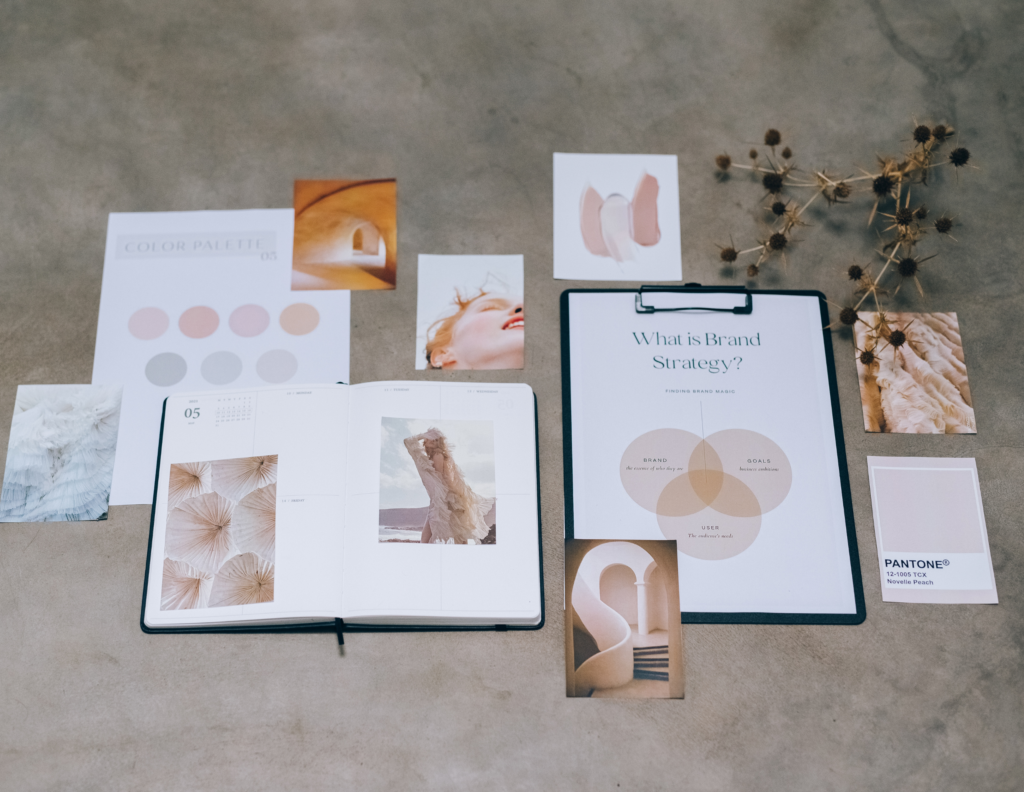
Regular design audits help catch inconsistencies before they become problems. Schedule quarterly reviews of your website to ensure all elements remain aligned with your brand guidelines. This proactive approach prevents visual drift over time.
Best Practices
Avoid common pitfalls by maintaining consistent spacing between elements. Use your established grid system as a guide for all layouts. Pay special attention to color contrast to ensure accessibility for all users.
Test your design system across different devices and screen sizes. What works on desktop might need adjustment for mobile views. Create flexible components that maintain their visual integrity across all breakpoints.
Conclusion
Building a cohesive visual system requires initial investment but pays dividends in brand recognition and user trust. Regular maintenance and updates keep your system relevant and effective. Remember that visual cohesion is an ongoing process – stay open to refinements while maintaining your core brand identity.
Take the first step by auditing your current website for visual consistency. Document existing patterns and identify areas for improvement. Then, create a roadmap for implementing your unified visual system. With careful planning and attention to detail, you’ll build a stronger, more cohesive brand presence online.